

![]()
![]()
|
Interesting Charts July 26, 2011 We can be Knowledgeable with other men's knowledge, but we cannot be wise with other men's wisdom. ~Michel de Montaigne
When one looks at 1-3 year charts one can miss the larger picture and mistakenly come to the conclusion that all is well. This is why it is imperative that one look at both the long term and short term charts. We at TI have our own modified version of the Dow Theory which has proved to incredibly accurate and useful to us over the past 11 years. Our version of the theory places most of the emphasis on the Dow utilities. In essence the utilities must lead the way up or down and not languish. Everything looks pretty fine when one examines 5 year charts of the Dow industrials and Dow transports but things change when one looks at the Dow utilities.

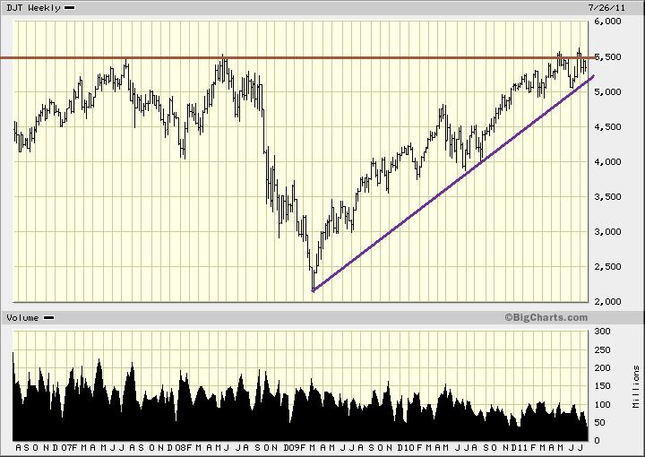
The charts of the Dow industrials and Dow transports both look relatively decent The Dow is roughly 10% away from testing its 5 year highs and the transports are more or less trading at their 5 year high. The picture is considerably different with the Utilities. While everything looks great in the 1-3 year charts, a 5 year chart clearly illustrates that all is not well. The utilities are trading well off their 5 year highs; in fact, they would have to mount a stunning rally to test their 5 year highs. From their current levels they would need to rally a whopping 29% to test their 5 year highs. Instead of leading, the utilities are clearly languishing. The fact that the utilities have not even managed to trade past their Nov-Dec 2008 lows, illustrates how weak they really are.
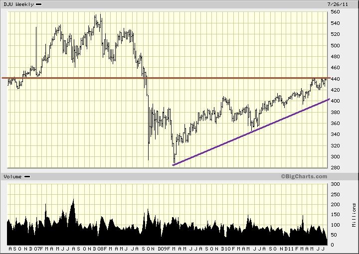
Conclusion The utilities are clearly indicating that the long term outlook is rather dire. They have not even managed to trade past their Nov-Dec 2008 lows. Instead of leading the way up it appears that they are languishing. Perhaps their inability to break out suggests that they might actually be leading the way down. Could this be harbinger of what lies in store for the markets in the months to come? If we look at the following charts they seem to support this view that all may not be well.
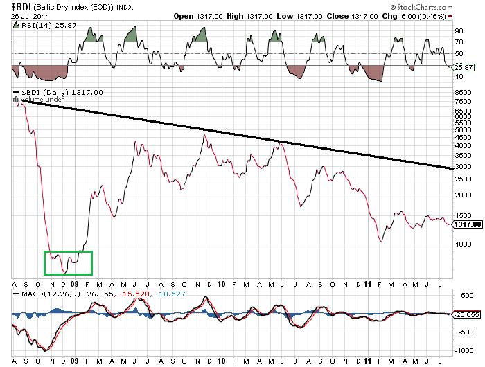
The Baltic dry index is a leading economic indicator. One look at this chart and it tells us that the worst is far from over. 3 years ago this index was trading in the 8000 plus ranges and today its trading at roughly 1310. It is off by almost 85%. It has been putting in a series of lower highs after topping out in Dec 2009 and in Feb 20011 it put in a new 52 week low. Should this index be trading at this level if the long term outlook was bright?
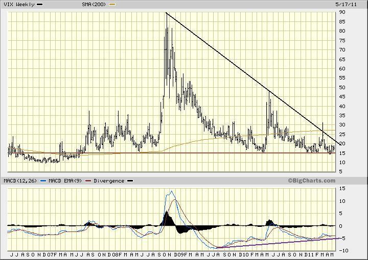
The 5 year chart of the VIX illustrates that it is trading at 5 year support and it is only a few points away from testing its lows. A multitude of positive divergence signals have been generated in the long term time frames (usually bearish for the markets). A weekly close above 30 will turn the daily trend bullish, neutralize the weekly down trend and strongly suggest that the VIX has bottomed.
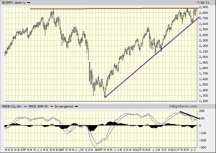
The 5 year chart of the NASDAQ illustrates that is has run into a zone of rather formidable resistance and it appears to have put in a triple top formation. Triple top formations are usually followed with substantial declines. In addition a series of negative divergence signals have been generated; none of the recent new highs were confirmed by any our technical indicators. Finally, consider this volume which is already extremely low, has dipped even more. Average volume is now roughly 1 billion shares lower than it was just 30-45 days ago. The data from the above charts is rather compelling because it is based on 5 years worth of weekly data. Thus these charts are giving us a good idea of what to expect going forward. The only exception to this is the chart of the BDI; here 3 years worth of daily data was used. Things are certainly heating up and it will be interesting to see where the markets are trading 3, 6 and 12 months from today. We live in such uncertain times that now more than ever it is imperative that one have some exposure to the precious metals sector (Gold, Palladium and Silver bullion). If you have no position at all then use any decent pull back to open up a small position. If the precious metals sector should experience a strong pull back you become an aggressive buyer. The long term outlook for the precious metals and commodities sector in general remains extremely bright.
Every man is a damn fool for at least five minutes every day; wisdom consists in not exceeding the limit. ~Elbert Hubbard
|